

-
Wixter Seafood is a sustainably sourced seafood line ranging from frozen, ready-to-eat, and tinned products.
parent company: Hofseth North America
-
Creative development, creative management, and project management responsibilities include leading and participating in creative brainstorms, interpreting strategy and setting the creative tone to deliver on business objectives, leading a creative team through design and production, collaborating with photo and copy partners in creative execution. Developed, created, and executed the brand identity, packaging, website, social media, and marketing designs for Wixter Seafood.
-
Print | Digital | Photography
Branding
Visual Identity
Web Design
Social Media Graphics
PowerPoint
POP
Store Signage

packaging
packaging design and development for 3 product categories with 27+ SKUs, ranging across various formats and sizes. customization of packaging was available upon request of retail and wholesale suppliers.
-
When developing Wixter Seafood, the goal wasn't simply to create beautiful packaging—it was to build a visual identity rooted in the brand's purpose, its consumer, and the realities of the category it needed to compete within.
Every design decision had a reason behind it, from the symbolism within the identity and the way information was prioritized to the use of color, product visibility, and tactile finishes. Just as importantly, the system needed to feel elevated and distinctive without losing accessibility, and flexible enough to evolve as the brand grew.
The result was a brand that felt entirely different from what consumers were accustomed to seeing in the seafood category, while still feeling authentic to the product and its story.
-
Wixter Seafood was built around a simple idea: make premium, sustainably sourced seafood more accessible while bringing greater transparency to an industry that can often feel confusing to consumers. Education was an important part of the brand from the beginning, so the identity and packaging needed to do more than look premium—it needed to communicate clearly, stand apart in a crowded category, and give consumers confidence in what they were buying.
The visual identity was inspired by nautical signal flags, a system historically used by vessels to communicate at sea. The connection felt particularly fitting for Wixter: not only did it create an authentic link to the maritime world, but the idea of communication directly reflected the brand's commitment to transparency and consumer education.
At the center of the identity is the Foxtrot flag, a maritime signal used to communicate that a vessel is disabled and requires assistance or communication. Its meaning took on unexpected significance as Wixter prepared to launch during the COVID-19 pandemic. What was originally envisioned as an in-store private label brand quickly pivoted toward a direct-to-consumer online model, allowing Wixter to ship seafood directly to customers at a time when access to traditional grocery shopping had become increasingly limited.
Suddenly, the Foxtrot flag represented more than a connection to the sea. A symbol rooted in communication and assistance had become the visual identity for a brand adapting to help consumers navigate an unprecedented disruption in how they accessed food. While COVID wasn't the reason the symbol was originally chosen, the circumstances surrounding the launch gave its meaning an additional, and unexpectedly fitting, layer of relevance.
-
Its central field of color became the primary communication zone, housing the most important product information and creating an immediate focal point. The surrounding space was intentionally kept minimal, while fine lines extending toward the center subtly guided the consumer's eye inward. This created a clear hierarchy that emphasized the information that mattered most without overwhelming the package.
Color became an integral part of the system, especially as bold, color-driven branding was beginning to emerge as a major design trend. We saw an opportunity to embrace that shift without allowing the brand to become overly trendy or tied to a specific moment in time. It also presented an opportunity to break from the visual conventions of the seafood category, where competitors typically relied on more traditional, restrained palettes rather than using color as a defining system.
By giving each product its own bold color, Wixter created a distinct and disruptive shelf presence while making the growing assortment easier for consumers to navigate. More importantly, color wasn't simply decorative, it became a functional part of the packaging architecture, differentiating products while maintaining a consistent and immediately recognizable Wixter identity. The result was a system that felt fresh and relevant to the changing visual landscape, yet simple and considered enough to remain timeless.
Scalability was equally important. What began as a four SKU assortment in a single format ultimately expanded to 27+ products across multiple formats, with the visual architecture flexing alongside the growing portfolio without sacrificing consistency, differentiation, or brand recognition.
-
relied on restraint—balancing bold color with clean typography, intentional negative space, and a simplified hierarchy to create a look that felt confident, elevated, and timeless without becoming overly designed.
Transparency was equally important, both as a brand value and a physical part of the packaging. Rather than relying on highly styled or retouched product photography that could create an unrealistic expectation of what was inside, we incorporated a window that allowed the seafood itself to become part of the design. Consumers could see the actual product they were purchasing, reinforcing both its quality and Wixter's commitment to being transparent about what it was putting into their hands.
That premium experience extended beyond what consumers could see to what they could physically feel. A soft-touch finish gave the packaging a smooth, velvety texture that immediately differentiated it from more conventional frozen seafood packaging. The tactile finish elevated something as simple as picking up the product, providing another subtle cue to the quality of what was inside.
Together, the visual restraint, product visibility, and tactile finish created a premium experience without relying on excess. The packaging didn't need to tell consumers the product was high quality it was designed to let them see it, feel it, and experience it for themselves.
Frozen Bags


Sashimi Kit


RTE Boxes


Half Shell Mussels Box


Tin Boxes


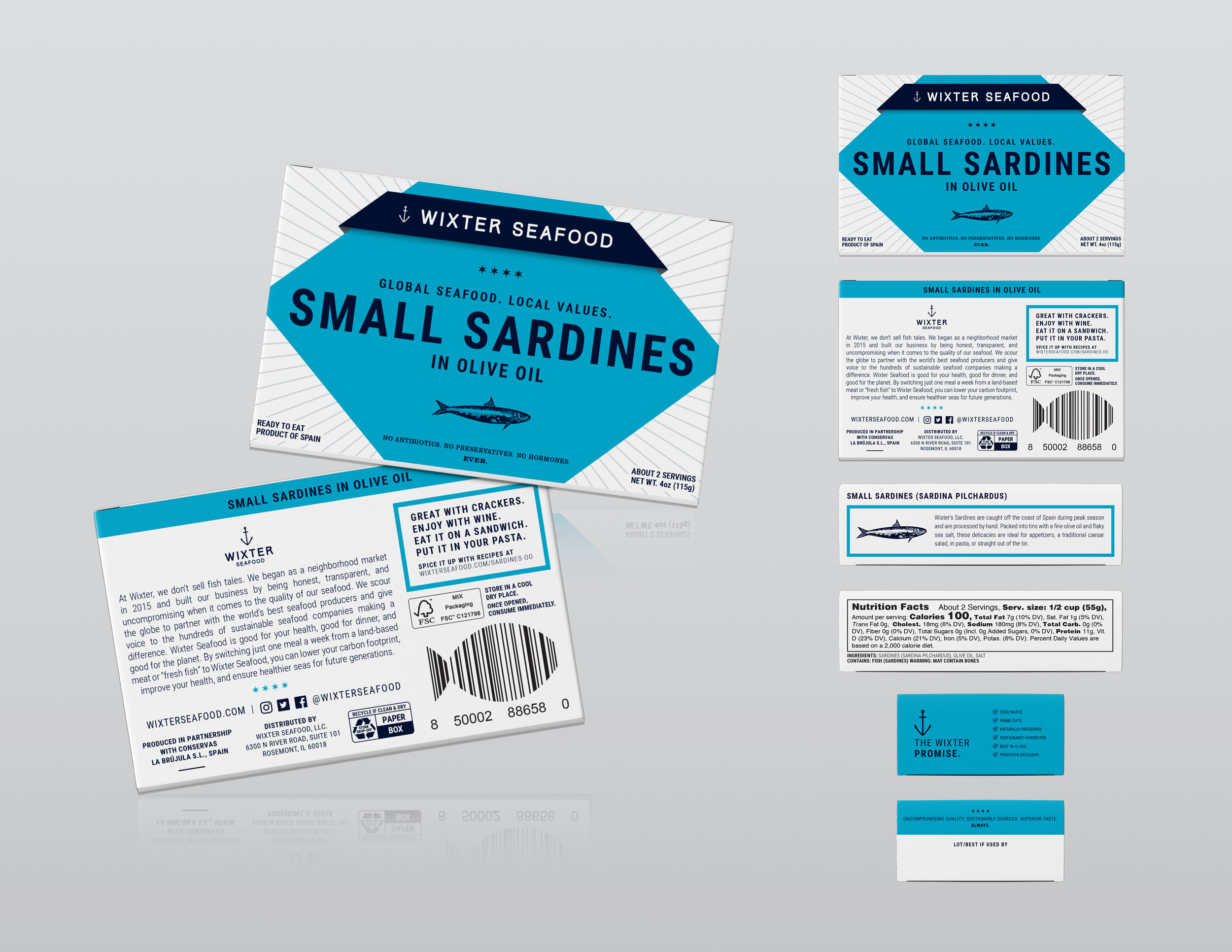
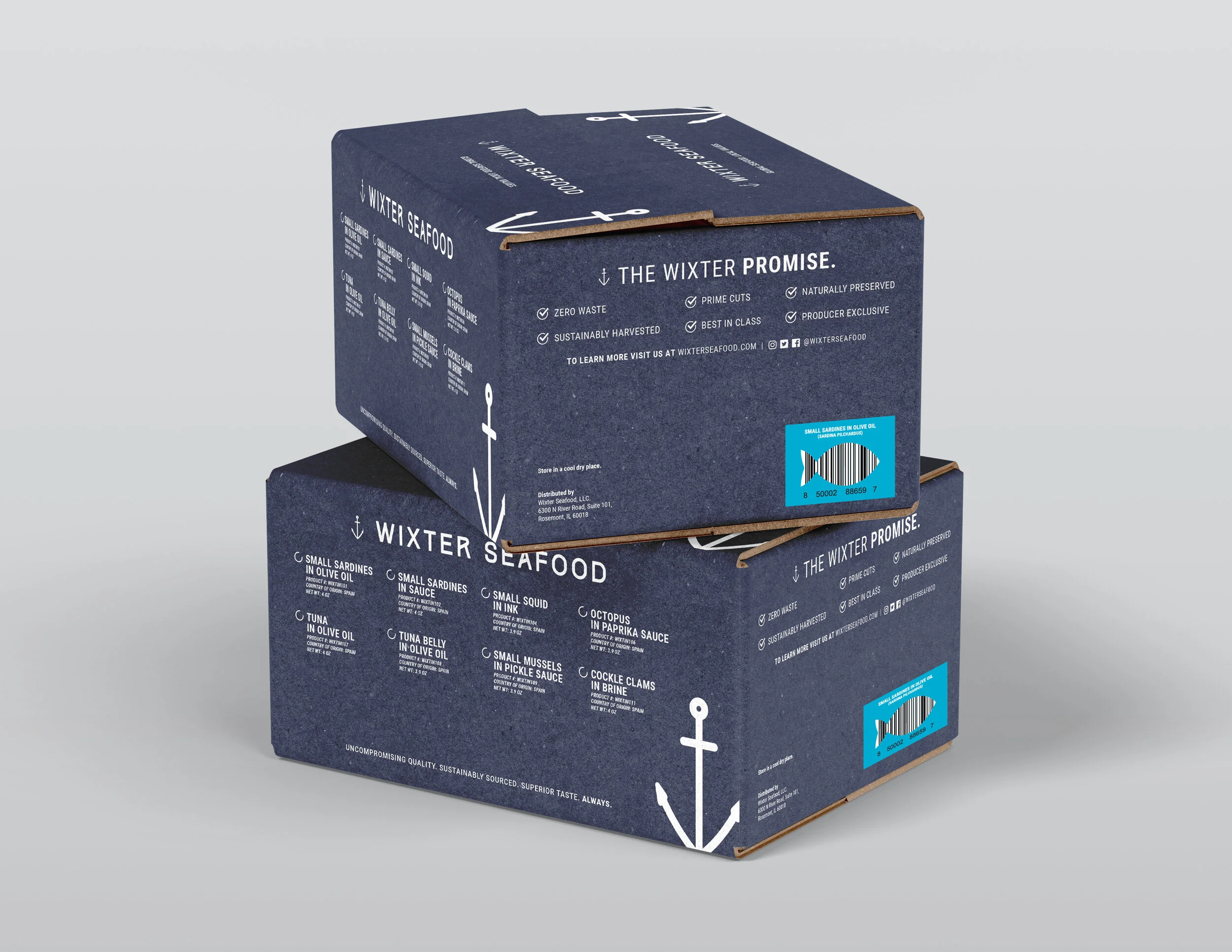
Display + Shipping Cases


marketing + store signage
designed print marketing collateral such as cards, flyers, brochures and sell sheets

Freezer Cling

Counter Display

Pamphlet

Freezer Bunker Display

Social Media Card
website


social media graphics


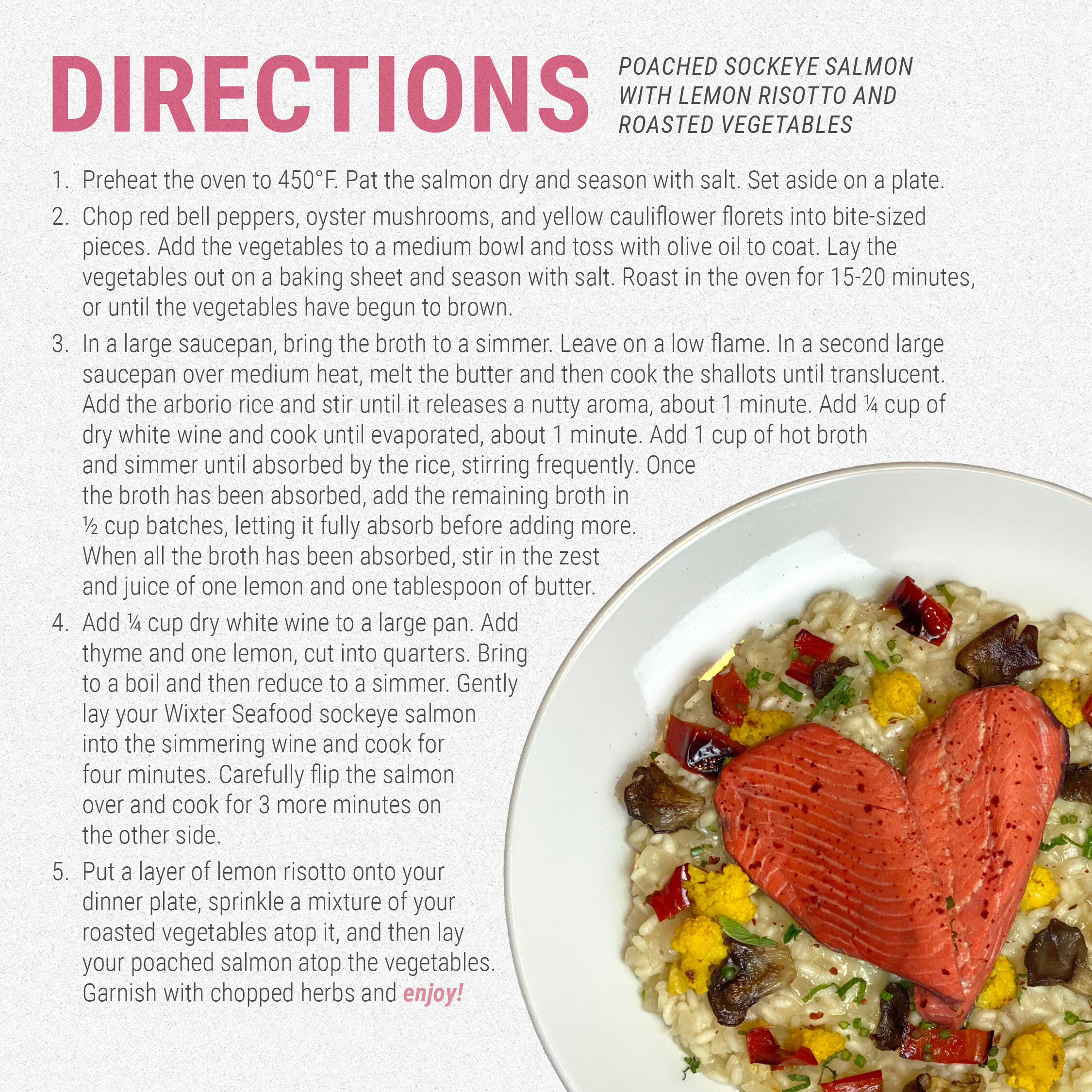


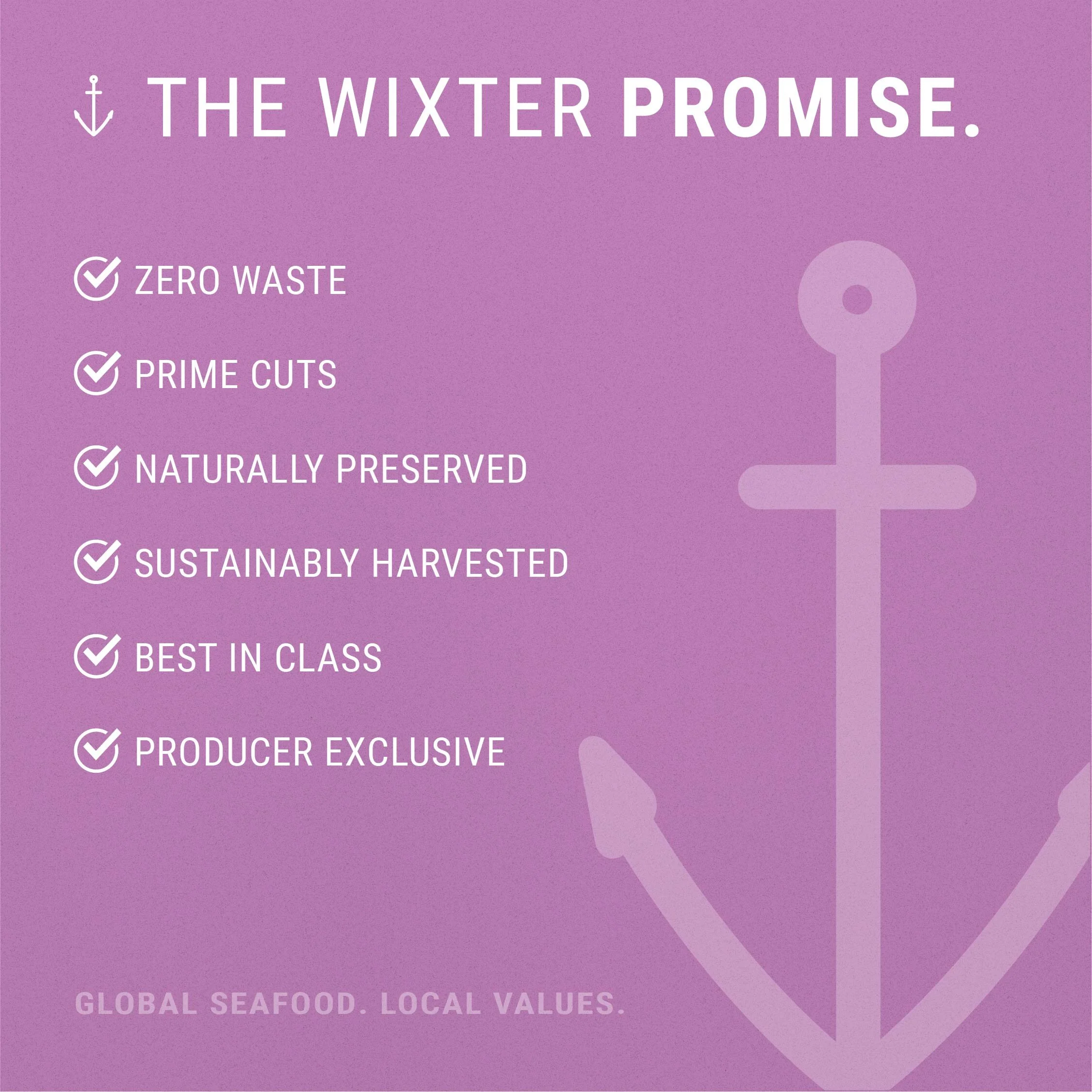


email + web banners


photography
My Photography


Directed Shoots


in the wild


